


Real Betis goes more global, connected and sustainable with their new brand identity
The Club and Accenture Song have designed a new visual universe based on a way of understanding life. Life in green. This new identity comes with a colour palette and the creation of a new typography, adapted to all kind of digital or analogic media
Real Betis Balompié present, as part of their 115th anniversary, their new visual identity to reinforce their position as a more global, more connected, and more sustainable Club. The value of Real Betis brand experienced a fast growth last season, being the team in LaLiga with the biggest increase in their value, according to Brand Finance. This created the perfect environment to renovate the Club's positioning, being faithful to our tradition and adapting our image to the current and future media.
Real Betis have chosen Accenture Song, a technological creative company, to lead this process. Both companies have worked together to find a more authentic, closer and more universal brand. The Club's crest maintains its basic shape, and a correct vectorial build has been implemented to unify and apply its use in all the sub-brands and business areas of the Club. All the secondary versions of the crest have been removed, outlining and empowering the new one, with has a cleaner design, optimised and adapted to be used even in the smallest digital media.
The main characteristic of Real Betis Balompié is the colour green. The Club's positioning and new visual universe are based on that colour. That tradition, passion, and fidelity that is transmitted from parents to children and grandparents to grandchildren. Focused on a brilliant future in which the community means everything, from Seville to the world. A way of understanding life. Forever Green.
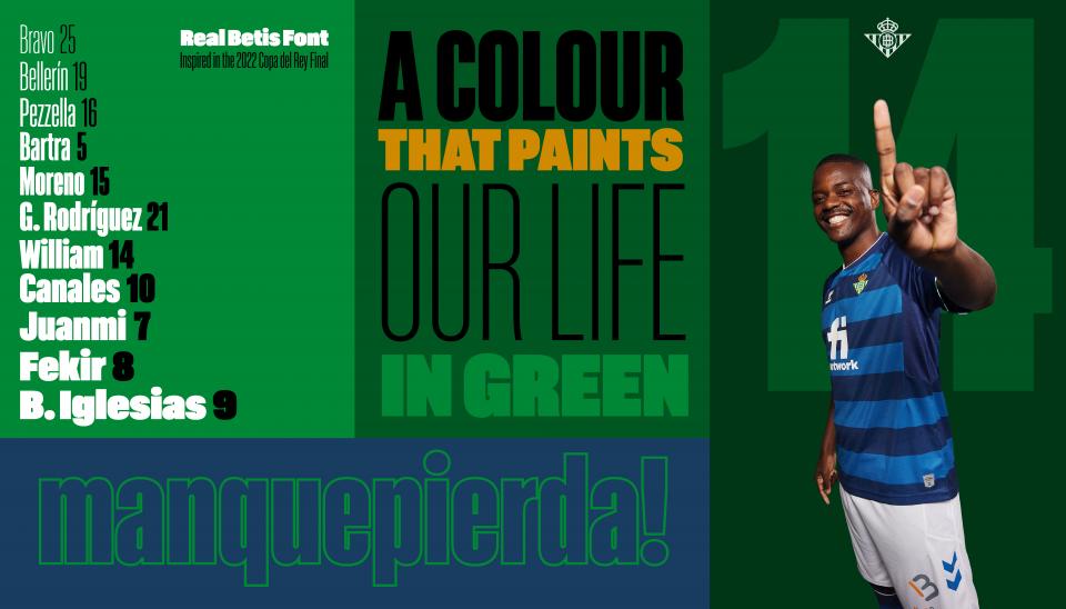
Real Betis and Accenture Song have established a new colour palette for the brand and also created a typography that unifies the entire rebranding process.
The new Real Betis new visual universe spins around the colour green. The colour Green Betis allows to reinforce the historic meaning, as well organically linking it to the institution's sustainability and social commitment. The colour palette us also optimised, adapted, and meets all the accessibility criteria for digital environments. The colour Green Betis is the reference along White Azahar. A new colour, Black Quejío, is added for sobriety, contrast and impact.
A unique, original and exclusive typography created for the Club is also included. It is the result of the work done by the prestigious Argentinian typographer Eduardo Manso, creator of the identities of Munich airport, The Sunday Times, ESPN Magazine, among others. He has chosen to create eleven different styles inspired in the starting eleven of the 2022 Copa del Rey final. Real Betis Font is a typographic family with its own personality.
The design composition is also highlighted. All the elements of the new brand are united in the Field Zone, a flexible reticule based on the playing pitch that allows to transmit the content in a clear and precise way, adapted to different platforms. From a shirt to a social network profile.
Carmen López, managing director of Accenture Song in Spain, Portugal and Israel, outlined the result of the work done together. "We have worked with the Club with a clear target in mind, building value in every message. We have respected Real Betis brand at all times, so the values and characteristics of the institution are projected in a differential way, complying with the target of reaching new markets. All of it, done with the highest simplicity, strength, diversity, personality, and brand expression."
Ramón Alarcón, Real Betis business general manager, outlined the importance of this change for Real Betis. "The digital and image environments have evolved quite a lot in latest years, and we wanted to update our brand. It is a complete universe that bases its strength in the new typography and colour palette, as well as the complete branding adaptation. We were looking to be bold in the world of football, with resources perfectly adaptable to any digital or analogic media. We are really satisfied with the final outcome, which will help Ream Betis to keep growing."
For further information: realbetislavidaenverde.es